
Search Analytics Dashboard
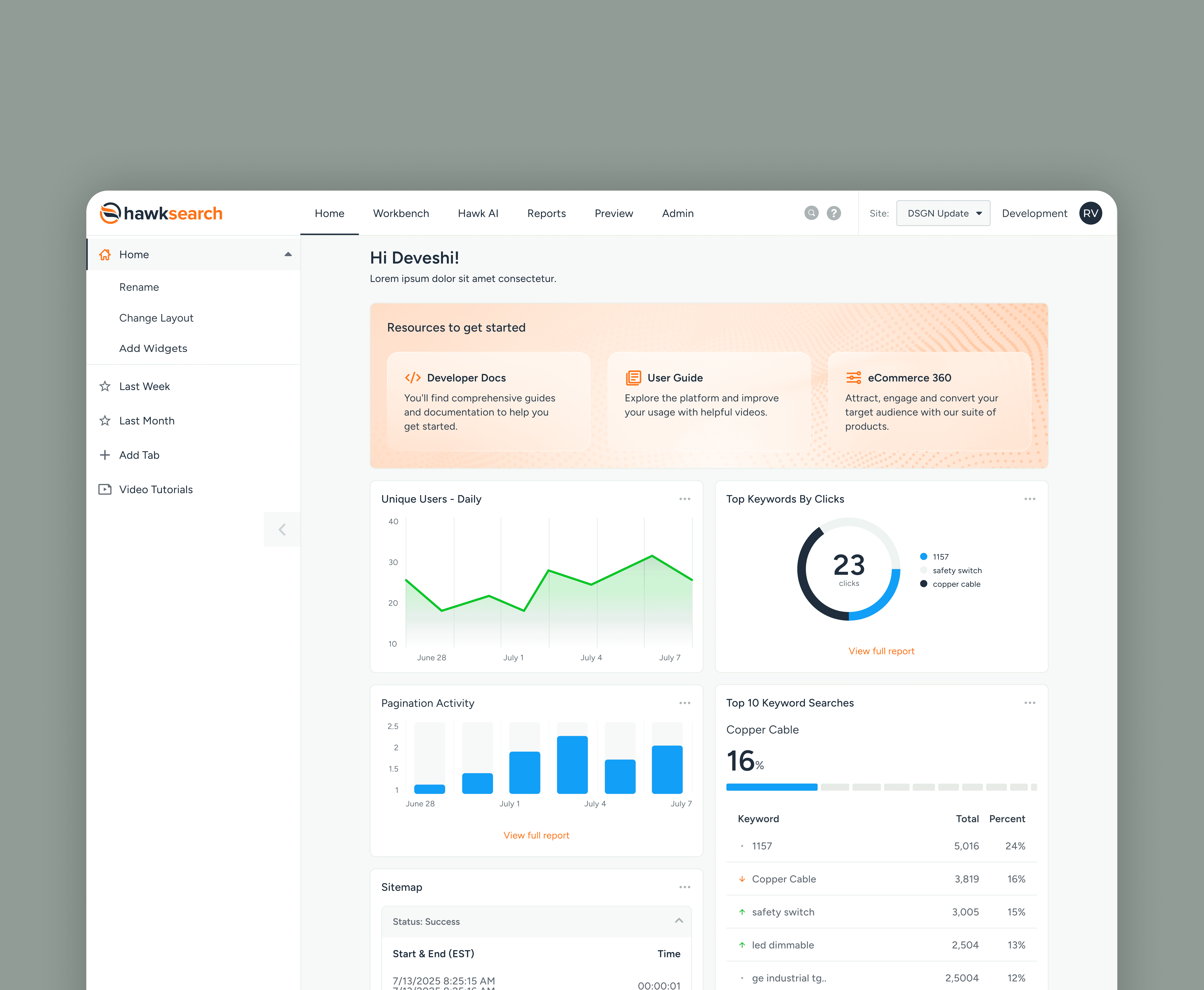
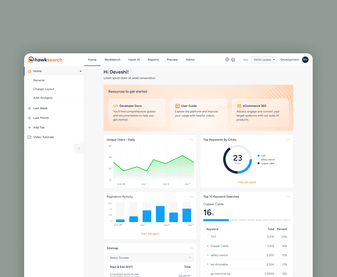
Visualizing search data to improve how users manage search logic, ranking, and merchandising rules.
Role
sole designer
Duration
3 months
Organization
Bridgeline
01 Overview
About the Co.
Bridgeline Digital, a MarTech company, developed HawkSearch. It is ranked #1 in Gartner’s 2025 Critical Capabilities (B2B Search) comprising 58% of company revenue and driving $8.9M in FY25.
The challenge
A dashboard that wasn’t usable.
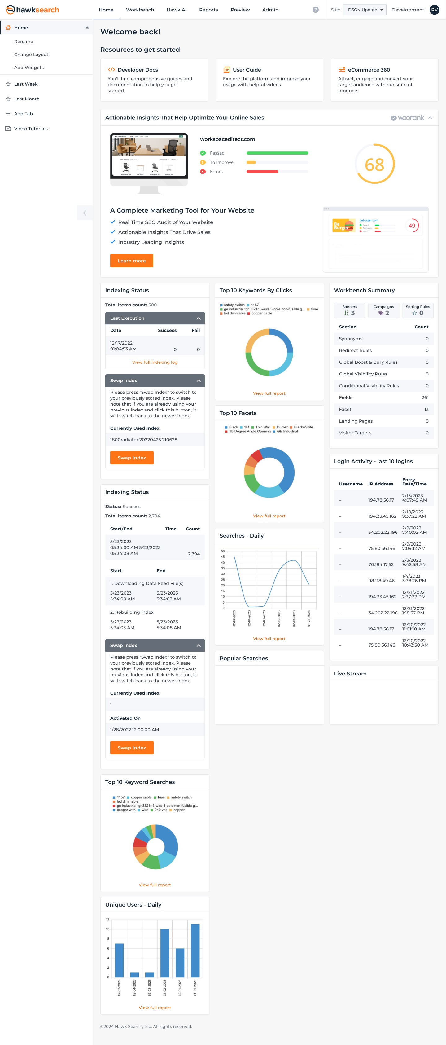
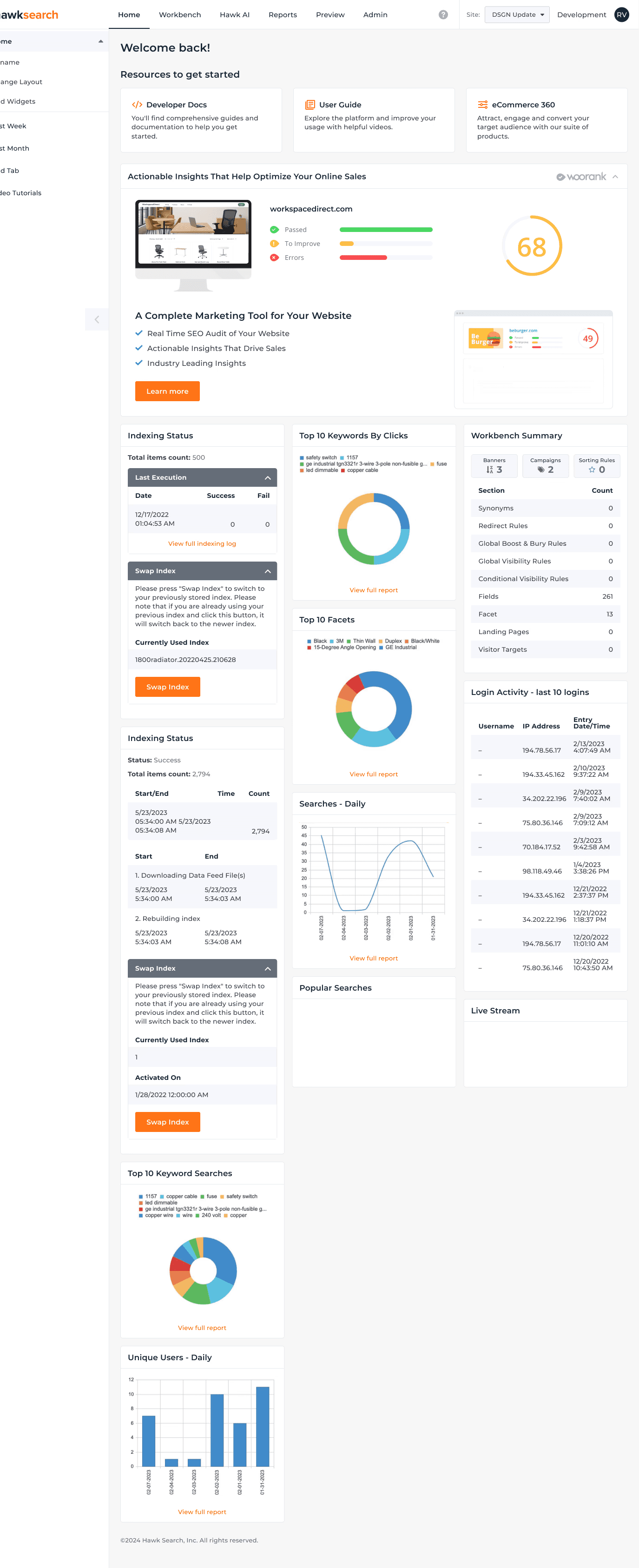
HawkSearch’s dashboard and admin experience had grown over time, but it wasn’t easy to use anymore. Core actions like managing widgets, navigating reports, and finding key insights felt cluttered and inconsistent, making the UI harder to learn, harder to demo, and less enterprise-ready.
The Old UI
Problem statement
How might we make HawkSearch’s dashboard easier to navigate and more consistent, so users can quickly find key insights and complete core tasks without friction?
02 Research
To understand where users were getting stuck in HawkSearch’s dashboard & admin experience, I ran two quick research tracks
Step 1
Heuristic Audit
Step 2
Interviews
Audits
What’s slowing users down?
I audited the dashboard and key admin flows to identify where the experience felt inconsistent, cluttered, or hard to navigate. This gave me a clear baseline of what was breaking usability and learnability.
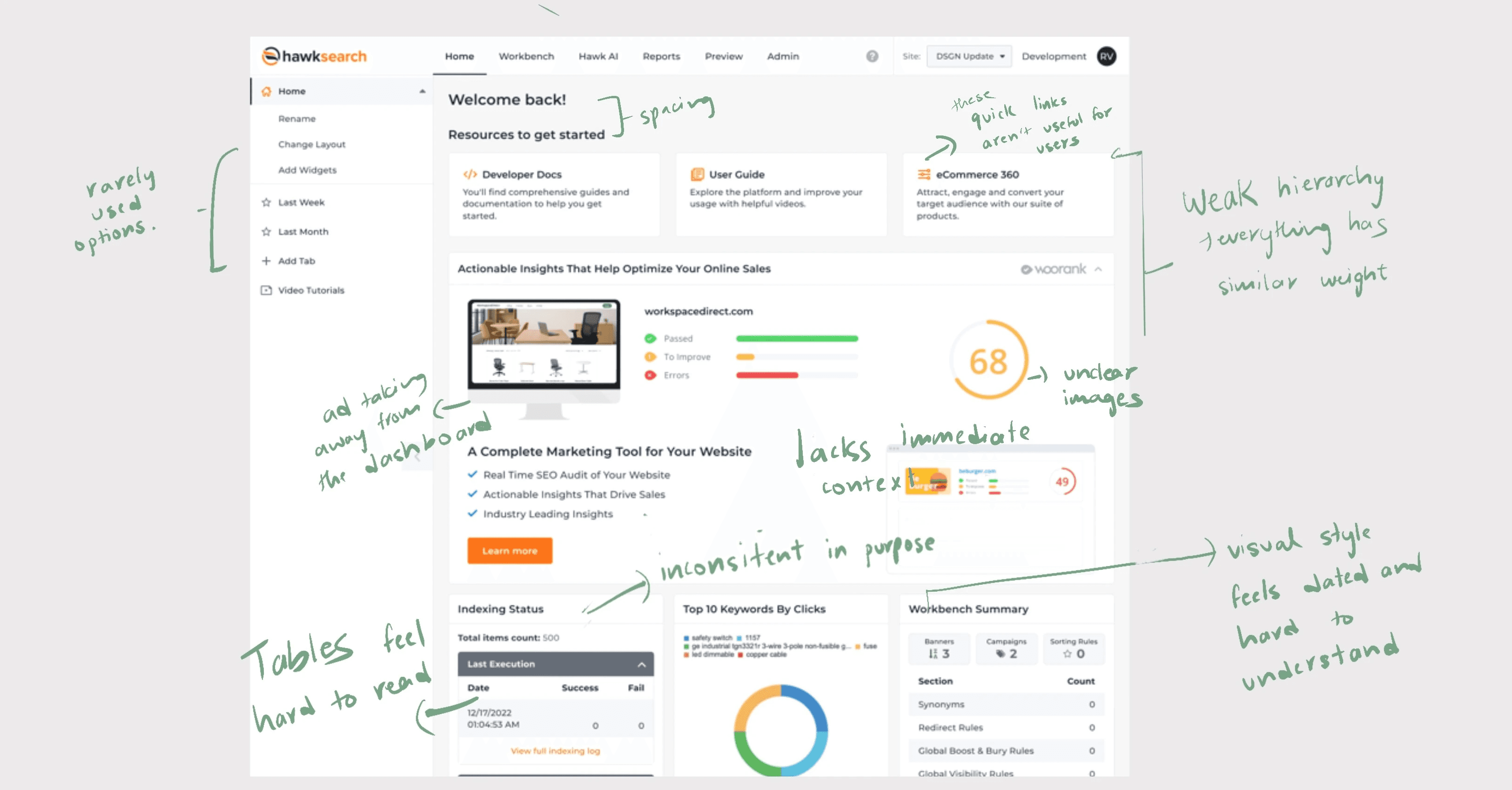
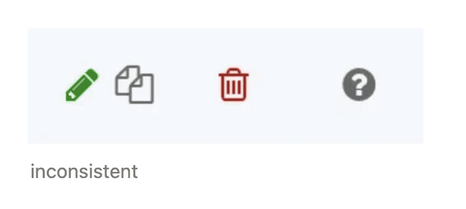
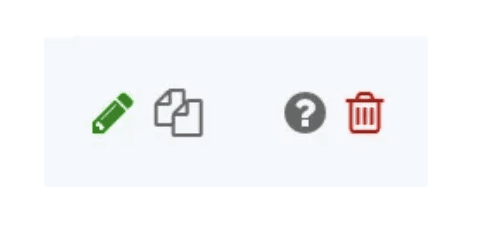
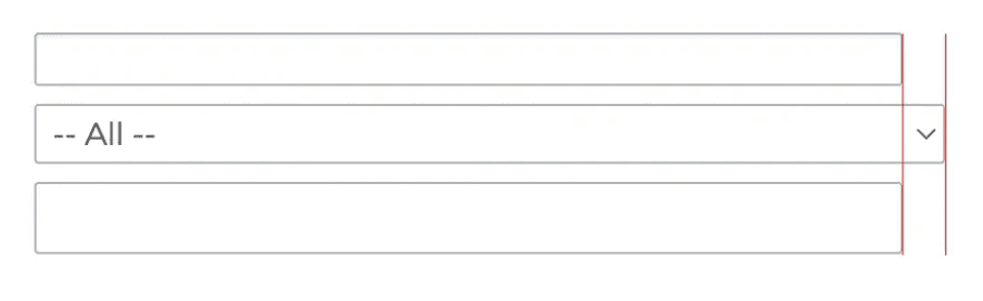
Here are the most common UI issues I kept seeing across screens.
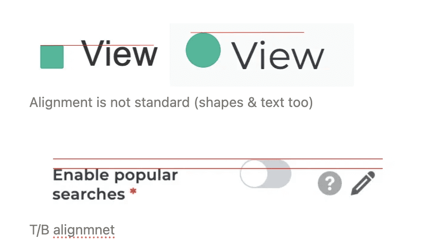
Alignment
Consistency
Spacing
Padding
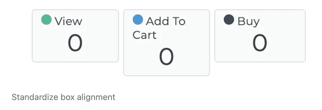
Cards
Animations
Cleaning up UI consistency was step one, but the bigger goal was making the dashboard feel easier to navigate and faster to use. After the audit, I used interviews to understand which workflows mattered most and where users felt stuck.
Interviews
Understanding the users
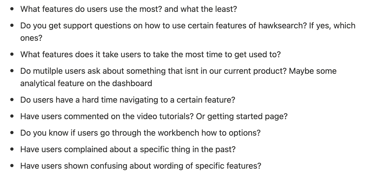
To understand what clients struggle with most in HawkSearch, I interviewed a client-facing stakeholder and focused on the questions that come up during onboarding, demos, and support.
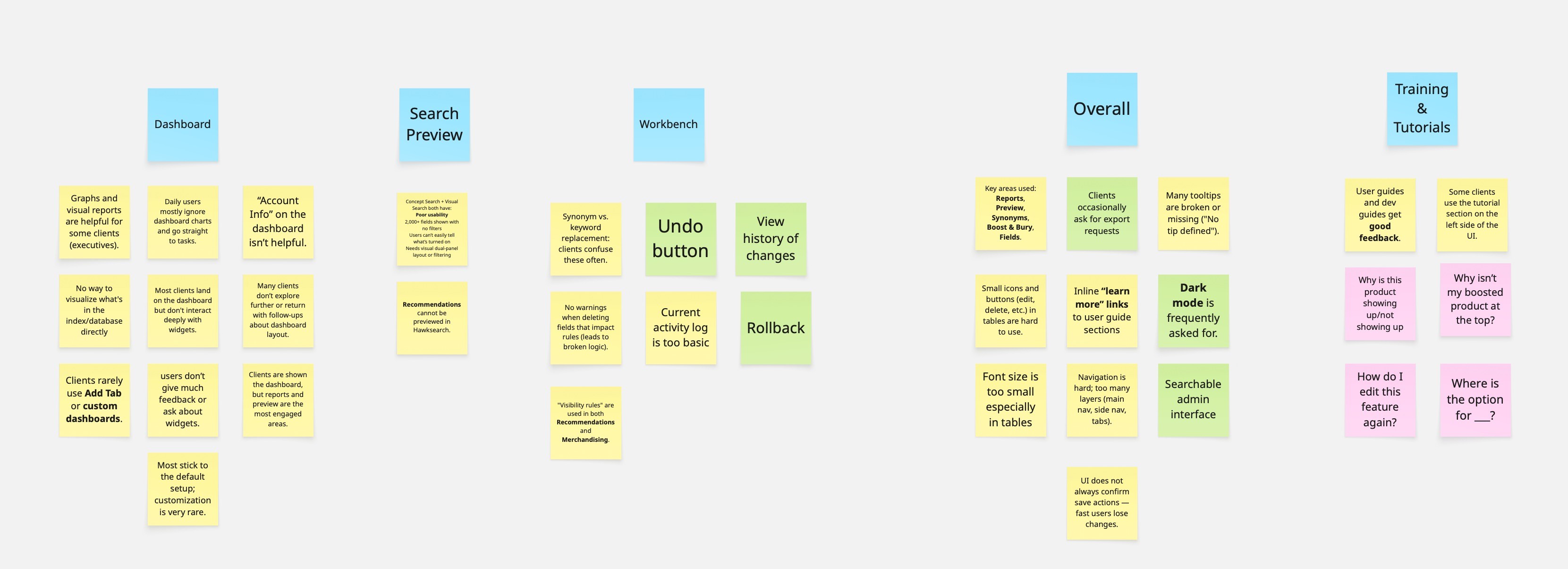
Grouped notes from the interview
into main themes.
The more I listened to interviews and support feedback, the clearer it got: users didn’t struggle with the data. They struggled with how the data was shown, and how much effort it took to get answers compared to tools they already use.
03 Design
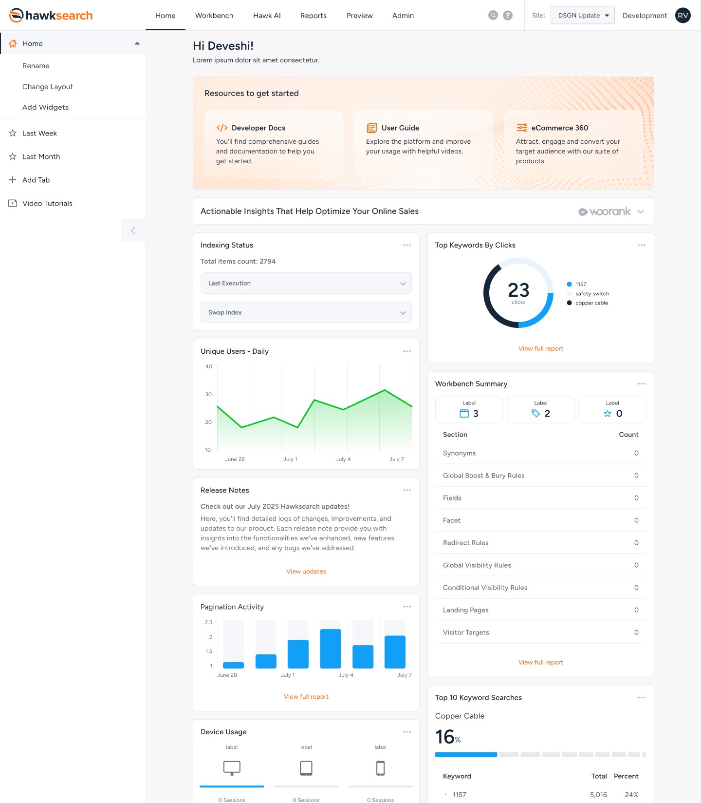
Dashboard that visualized information with well defined widgets
After research, it was clear HawkSearch needed a dashboard that felt easier to scan, more consistent, and faster to use. So I treated widgets as the core building blocks and redesigned the dashboard by improving hierarchy, widget behavior, and clarity.
1) Rebuilt the dashboard hierarchy
Instead of treating the dashboard like a stack of cards, I reorganized it so it reads top to bottom and highlights what matters first.
Reordered widgets based on importance + frequency
Made the first screen easier to scan without scrolling
Reduced the “everything feels the same” layout
2) Standardized the widget system
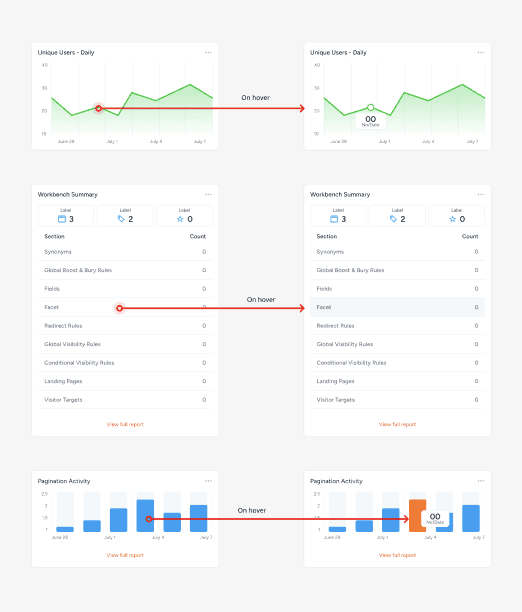
I mapped all widget types and tightened the rules so widgets feel like one product, not a mix of different styles.
Created a widget inventory + matched widgets to chart types
Standardized spacing, padding, and alignment inside widgets
Made hover + interactions consistent across cards
3) Removed visual noise (kept only what supports the workflow)
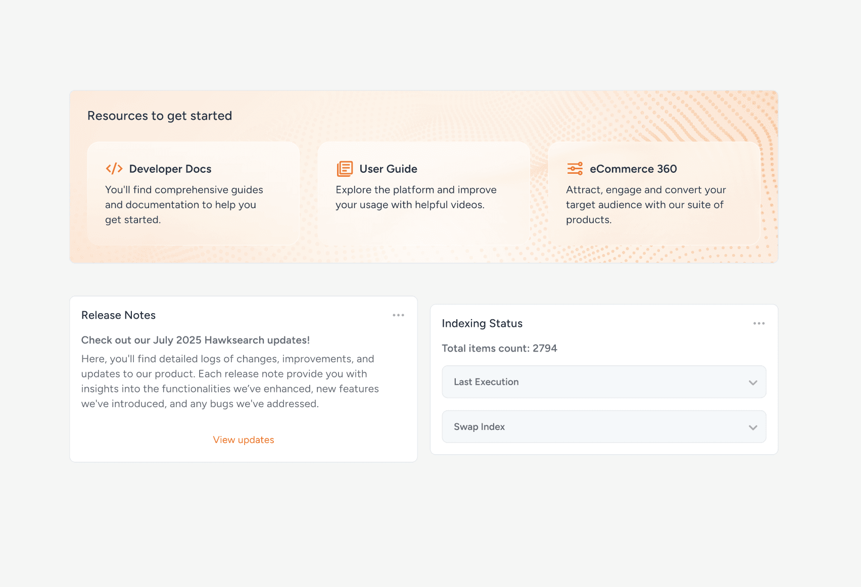
I stripped out anything that added clutter without helping users get insights.
Removed low-signal widgets (login activity, account info, announcements)
Adjusted the banner so it doesn’t read like another widget
Used “View all” / scroll patterns to keep the dashboard clean
We tested the prototype with users using quick tasks and questions to validate that the new widget system felt clearer and easier to navigate.
More Snippets
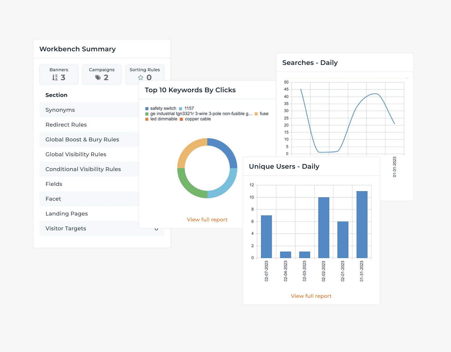
Before
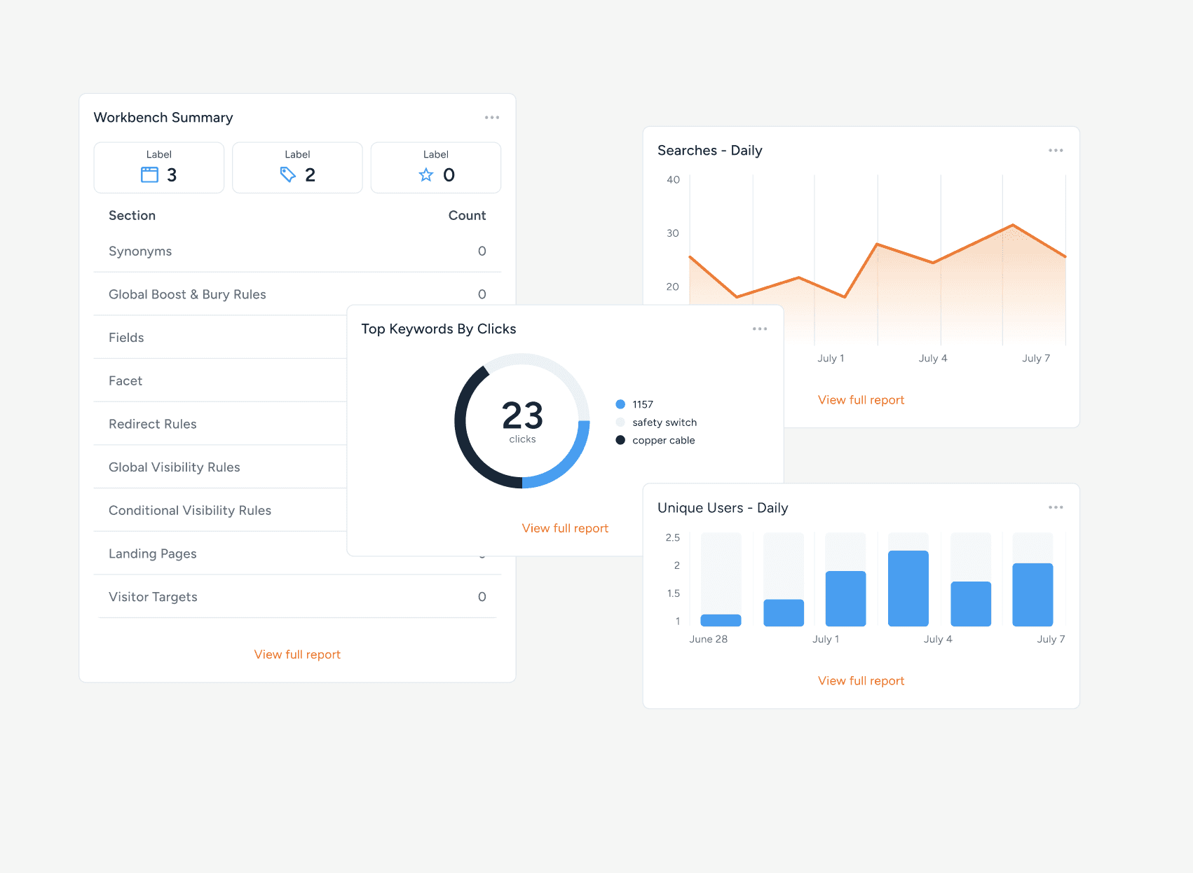
After
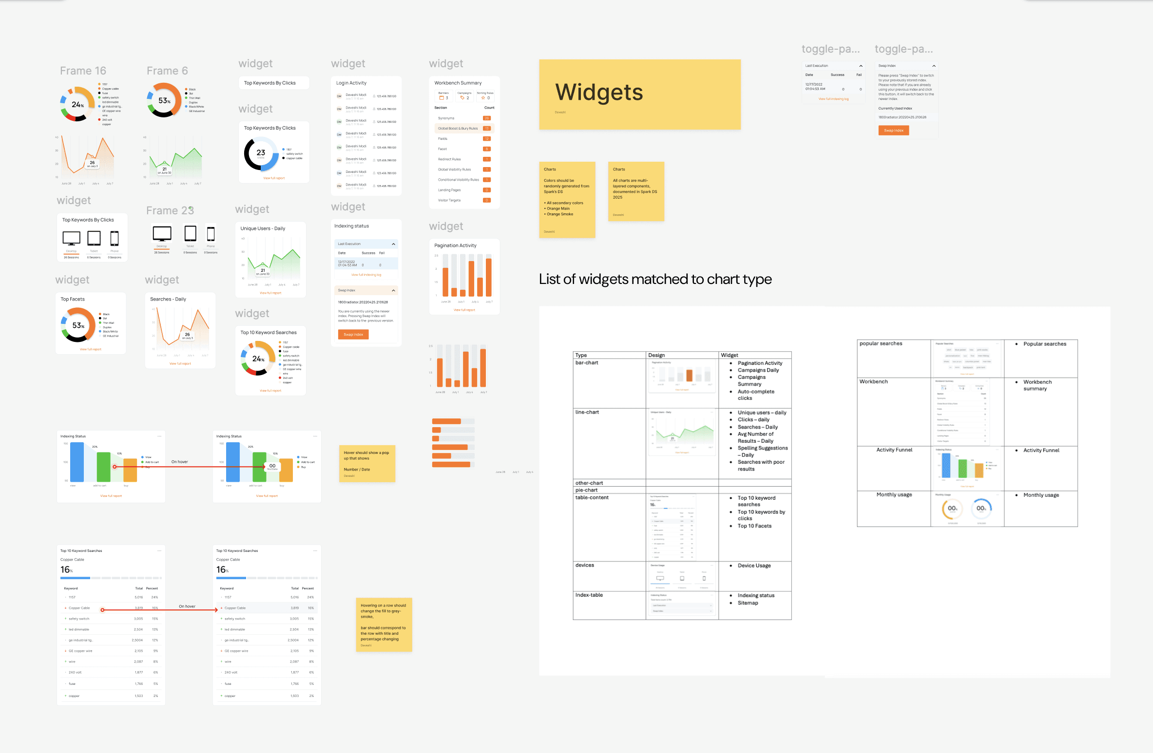
Exploration
04 Reflection
This project reminded me that I don’t need to have all the answers at the start. I learned that taking time to map things out, ask questions, and simplify what’s already there leads to better decisions than jumping straight into redesigning. It also showed me that small, careful changes can make a product feel much easier to use, and that being willing to remove things is sometimes the most impactful part of the work.